

On this page
8 sectionsBrowse the main headings and deeper subtopics from this article.
Recommended next
If you’re a founder, freelancer, or small agency launching a product in 2026 — and you’ve searched for a tailwind responsive landing page — you’ve likely hit one of two walls: static Figma mockups that don’t translate to real code, or AI tools that generate uneditable HTML/CSS blobs with broken mobile behavior. In 2026, that’s no longer acceptable. A true tailwind responsive landing page must be production-grade, fully editable, and responsively resilient — not just pixel-perfect on three breakpoints, but adaptive across device classes, input modes, and accessibility contexts.
This guide cuts through the noise. We’ll explain what makes a Tailwind landing page genuinely responsive in 2026, why most ‘responsive’ templates fail under real-world conditions, how modern AI-powered builders like ZyloCode’s AI responsive landing page builder meet today’s technical bar — and how to choose, customize, and deploy a tailwind responsive landing page that ships fast *and* scales sustainably.
What Defines a True Tailwind Responsive Landing Page in 2026?
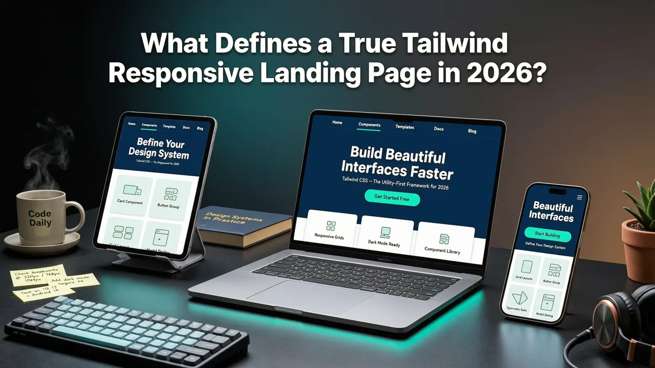
In 2026, “responsive” is table stakes — not a feature. A tailwind responsive landing page isn’t defined by whether it shrinks on mobile. It’s defined by how intelligently it adapts when:
- A user switches from touch to keyboard + mouse mid-session (e.g., hybrid laptops)
- A screen reader announces content in an unexpected DOM order due to layout shifts
- Dynamic font loading triggers reflow on slow 3G connections
- Dark mode preference changes *after* initial render
- Viewport width falls between common breakpoints (e.g., 428px, 769px, 1124px)
That’s where Tailwind CSS — paired with Next.js — delivers its 2026 advantage. Tailwind’s utility-first system doesn’t lock you into rigid grid abstractions. Instead, it gives you precise, composable control over spacing, typography, visibility, and interaction states — all while compiling to minimal, cacheable CSS. When combined with Next.js App Router features like useOptimistic, useFormState, and automatic image optimization, you get a tailwind responsive landing page that’s not only visually adaptive but also performant, accessible, and resilient.
Crucially, 2026 responsiveness includes semantic responsiveness: using semantic HTML (<main>, <section>, <nav>) alongside Tailwind’s sr-only, focus-visible, and motion-safe variants to ensure assistive technologies interpret layout intent correctly — even as visual structure changes across viewports.
Why Most Tailwind Landing Page Templates Fail the 2026 Standard

Not all Tailwind-based landing pages are created equal — especially when sourced from free template libraries, marketplace themes, or outdated GitHub repos. Here’s why many fall short in 2026:
1. Breakpoint Rigidity — Not Fluid Adaptation
Many templates rely exclusively on Tailwind’s default sm, md, lg, xl, and 2xl breakpoints — hardcoded at fixed pixel values. But in 2026, devices span from foldables (720px wide, dual-screen) to ultra-wide desktops (3840px+), and users increasingly resize windows freely (especially on macOS and Windows 11). A truly responsive design uses fluid typography (clamp()), container-relative units (rem, ch, vw), and media queries based on aspect ratio or container size — not just viewport width.
2. Missing Interaction & Input Mode Awareness
A 2026 tailwind responsive landing page anticipates how users interact — not just how they view. That means:
- Hover effects disabled on touch-only devices (via
@media (hover: hover) and (pointer: fine)) - Focused states enhanced for keyboard navigation (not just
focus, butfocus-visible+ custom focus rings) - Reduced motion preferences respected (
prefers-reduced-motion: reduce) - Pointer accuracy handled via
pointer-eventsand tap target sizing (minimum 48×48px per WCAG 2.2)
Most prebuilt templates ignore these entirely — or implement them inconsistently.
3. Static Structure, Not Semantic Flow
Responsive ≠ rearranged. Many templates use flex-col on mobile and flex-row on desktop — but fail to adjust heading hierarchy, reading order, or landmark roles accordingly. A screen reader may still announce a mobile-ordered list as if it were a desktop sidebar. In 2026, responsive design includes structural awareness: using aria-flowto, logical heading levels (h1 → h2 → h3), and dynamic role assignment based on context.
4. No Built-in Performance Guardrails
A truly responsive landing page loads *responsively* — meaning perceived performance matches user expectations. Yet most templates ship with:
- Unoptimized hero images (no
next/imageintegration) - Blocking third-party scripts (analytics, chat widgets) loaded at
head - No lazy-loading for offscreen sections (e.g., testimonials, FAQs)
- No font loading strategy (FOIT/FOUT mitigation)
In 2026, Google’s Core Web Vitals remain critical — and LCP, CLS, and INP thresholds have tightened. A tailwind responsive landing page must ship with performance baked in — not bolted on.
How to Build a Production-Ready Tailwind Responsive Landing Page in 2026
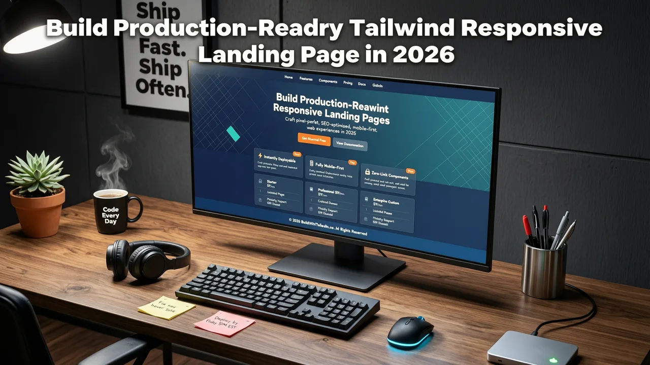
Building a tailwind responsive landing page that meets 2026 standards doesn’t require writing every line from scratch — but it does demand intentionality at each layer. Here’s a proven workflow used by founders and agencies shipping sites with ZyloCode’s Next.js landing page generator.
Step 1: Start With Intent, Not Aesthetics
Before choosing colors or fonts, define your conversion intent and user journey. Ask:
- What’s the *single* primary action you want users to take?
- What friction points exist between landing and conversion? (e.g., unclear value prop, trust gaps, form fatigue)
- Which sections must load instantly? Which can be deferred?
This shapes your responsive architecture — e.g., placing the CTA above the fold on mobile *and* desktop, but adjusting its prominence and supporting copy based on attention metrics.
Step 2: Use Modern Next.js + Tailwind Foundations
Avoid legacy setups. In 2026, best practice means:
- Next.js 15+ with App Router, Server Components, and Turbopack (default dev server)
- Tailwind CSS v4+ with JIT compilation,
themeextensions for brand tokens, andpluginsfor accessibility utilities - Automatic dark mode support via
class-based toggling (notprefers-color-schemealone) - Font optimization using
@font-facewithfont-display: swapand local fallbacks
Example responsive container setup:
// app/layout.tsx
export default function RootLayout({
  children,
}: {
  children: React.ReactNode;
}) {
  return (


        {children}


  );
}
And a fluid section wrapper:
// components/Section.tsx
export default function Section({
  children,
  className = "",
}: {
  children: React.ReactNode;
  className?: string;
}) {
  return (

      {children}

  );
}
Step 3: Design Responsiveness Layer by Layer
Don’t think “mobile-first” or “desktop-first.” Think context-first. For each component, define behavior across dimensions:
| Component | Mobile (≤640px) | Tablet (641–1023px) | Desktop (≥1024px) | Accessibility Notes |
|---|---|---|---|---|
| Hero headline | text-3xl leading-tight |
text-4xl leading-tight |
text-5xl md:text-6xl leading-none |
Ensure contrast ≥ 4.5:1 against background; avoid text-transparent + background-image combos |
| CTA button | py-4 px-6 w-full |
py-3 px-5 |
py-3.5 px-6 |
Add aria-label if icon-only; ensure focus ring visible and non-destructive |
| Feature grid | grid-cols-1 gap-6 |
grid-cols-2 gap-6 |
grid-cols-3 gap-8 |
Use role="list" + role="listitem" for semantic grouping |
| Navigation | Off-canvas menu with aria-expanded |
Horizontal flex with overflow scroll | Full horizontal nav + search | Keyboard trap inside mobile menu; escape closes |
Step 4: Validate Responsiveness Beyond Pixels
Run these checks before launch:
- Resize test: Drag browser window from 320px to 3840px — no horizontal scroll, no clipped text, no collapsed CTAs
- Zoom test: Zoom to 200% — all interactive elements remain tappable, text remains legible
- Color test: Enable OS-level grayscale, high contrast, and forced colors — does layout hold? Is contrast preserved?
- Input test: Navigate entirely via keyboard (Tab, Enter, Space, Arrow keys) — is focus order logical? Are all actions reachable?
- Performance test: Simulate 3G + low-end device in Chrome DevTools — does LCP occur < 2.5s? Is CLS < 0.1?
These aren’t edge cases — they’re baseline expectations in 2026.
ZyloCode’s Approach to Tailwind Responsive Landing Pages
ZyloCode was built specifically to eliminate the gap between “AI-generated” and “production-ready.” Our AI responsive landing page builder doesn’t output static HTML or locked Figma files. Instead, it generates clean, semantic, Next.js + Tailwind code — fully editable in-browser, with live preview and one-click deployment.
Here’s how it delivers on the 2026 definition of a tailwind responsive landing page:
✅ Real-time, Editable Tailwind Code
Every generated site includes a built-in code editor powered by Monaco (same engine as VS Code). You see and edit actual .tsx files — no abstraction layer. Change md:grid-cols-2 to md:grid-cols-3, add motion-safe:animate-fadeIn, or refactor a component — and preview instantly. This is editable AI, not “AI-assisted copy-paste.”
✅ Responsive-by-Default Architecture
ZyloCode’s prompt-to-code engine understands responsive intent. Describe “a hero section with headline, subheadline, and CTA button stacked vertically on mobile, then side-by-side on desktop,” and it outputs:
<div className="flex flex-col md:flex-row items-center justify-between gap-8">
  <div className="md:w-1/2">
    <h1 className="text-4xl md:text-5xl font-bold">...</h1>
    <p className="mt-4 text-lg text-gray-600 dark:text-gray-400">...</p>
  </div>
  <div className="md:w-1/2 w-full">
    <Button size="lg">Get Started</Button>
  </div>
</div>
No guesswork. No manual breakpoint hunting.
✅ Built-in 2026 Performance & Accessibility Guards
Every generated site includes:
- Automatic
next/imagewithpriority,loading="lazy", andaltfallbacks - Font loading with
font-display: swapand system font stacks - Dark mode toggle with persisted preference (localStorage +
useEffect) - Accessible navigation with skip links, proper ARIA attributes, and keyboard traps
- CLS-minimized animations using
transformandopacityonly
These aren’t optional plugins — they’re compiled in by default.
✅ Export or Deploy — Your Choice
Unlike SaaS website builders that lock your code, ZyloCode gives you full ownership:
- One-click deploy to Vercel, Netlify, or Cloudflare Pages
- Export as ZIP with full Next.js + Tailwind project structure (ready for GitHub, CI/CD, or agency handoff)
- Sync to Git (Pro plan) for version-controlled collaboration
This aligns with Google AI guidance on responsible tooling: “AI should augment human agency — not replace it.” Source: Google AI Responsibility Principles.
Free vs. Pro Tailwind Responsive Landing Page Builders in 2026
Not all builders treat responsiveness equally. Here’s how leading options stack up for founders and agencies who need more than a screenshot:
| Feature | Free Template Libraries (e.g., Tailwind UI, Creative Tim) | No-Code AI Builders (e.g., Wix ADI, Bookmark) | ZyloCode (AI + Next.js + Tailwind) |
|---|---|---|---|
| Editable source code | ✅ Yes (raw HTML/Tailwind) | ❌ No (locked dashboard, no export) | ✅ Yes (full Next.js project, Monaco editor) |
| True responsive behavior | ⚠️ Partial (static breakpoints, no input-awareness) | ⚠️ Partial (often uses fluid containers but breaks on zoom/resize) | ✅ Yes (adaptive breakpoints, pointer/hover/motion-aware) |
| Accessibility compliance | ❌ Manual fixes required | ❌ Rarely tested beyond color contrast | ✅ Built-in (semantic HTML, ARIA, keyboard nav) |
| Deployment options | ⚠️ Self-host only (requires dev setup) | ✅ Hosted only (vendor lock-in) | ✅ Deploy anywhere or export full code |
| 2026 performance readiness | ❌ Often bloated, no image/font optimization | ✅ Good LCP, but poor CLS/INP on complex interactions | ✅ Optimized by default (Next.js + Turbopack) |
For founders shipping MVPs or freelancers delivering to clients, the choice is clear: editable, responsive, and owned — or none of the above.
Frequently Asked Questions
Below are common questions about building and deploying a tailwind responsive landing page in 2026 — answered with technical precision and real-world context.
Can I use Tailwind’s responsive utilities without Next.js?
Yes — Tailwind works with any framework or plain HTML. But in 2026, pairing it with Next.js unlocks critical responsiveness advantages: automatic image optimization, client-side hydration control, streaming SSR for faster TTFB, and built-in accessibility linting via ESLint plugins. Without Next.js, you’ll manually implement what Next.js provides out-of-the-box — increasing risk of CLS, LCP delays, and inconsistent dark mode behavior.
Do I need to write custom CSS for advanced responsive behavior?
Rarely — and only for highly specific interactions. Tailwind v4+ supports @layer directives, arbitrary values (e.g., max-w-[82ch]), and CSS nesting via PostCSS. For 95% of use cases — including fluid typography (text-[clamp(1.25rem,4vw,2.25rem)]), container queries (@container (min-width: 400px)), and reduced motion — Tailwind’s utility classes are sufficient. Custom CSS should be reserved for complex animations or deeply nested component logic.
How do I test responsiveness on real devices without buying ten phones?
Leverage browser dev tools wisely: Chrome and Edge now simulate foldables, dual-screen devices, and even AR glasses viewports. Combine this with OpenAI’s browser automation APIs (for scripted resize + interaction tests) and free services like BrowserStack’s public device cloud (available to open-source and early-stage projects). Also — always test on one real iOS and Android device. Nothing replaces tactile feedback on tap targets and scroll inertia.
Conclusion: Your Tailwind Responsive Landing Page Should Be Alive — Not a Snapshot
A tailwind responsive landing page in 2026 isn’t a static artifact. It’s a living, editable, performance-optimized artifact — built with modern primitives, tested across real contexts, and owned end-to-end. Whether you’re validating a startup idea, launching a freelance portfolio, or delivering a site to a client, the bar has risen: responsiveness now means resilience, adaptability, and responsibility — to users, to browsers, and to your future self maintaining the code.
If you’re ready to generate a tailwind responsive landing page that meets the 2026 standard — editable, semantic, and production-ready — try ZyloCode. Start with a free Hobby plan, build your first Next.js + Tailwind site from a text prompt in under 90 seconds, and deploy or export with confidence. Because in 2026, your landing page shouldn’t just look good — it should work, everywhere, for everyone.
Apply the playbook
Ready to build your website?
Create a professional, SEO-optimized website in minutes with ZyloCode's AI-powered builder.
Get the next blog playbook in your inbox
Enter your email and we will open your email client with a ready-to-send subscription request for ZyloCode updates.
Previous article
Next.js Landing Page Generator – Build Production-Ready Sites from
Discover the best Next.js landing page generator in 2026: AI-powered, fully editable, exportable Next.js + Tailwind code with live preview and one-click deployment — no
Next article
Build Landing Page from Text Prompt – Production-Ready in 2026
Build landing page from text prompt with ZyloCode: AI-powered, editable Next.js + Tailwind sites generated in seconds. Free tier available. No dev skills needed.
Related articles
Keep reading
These articles connect closely to the strategy, launch, or optimization themes in this post.

AI Responsive Landing Page Builder – Build Production-Ready Sites in
The best AI responsive landing page builder in 2026: generate, preview, edit, and deploy real Next.js + Tailwind sites from text prompts — no dev skills needed.


